How content works here
Pages are built in the standard WordPress editor (Gutenberg) by stacking blocks. Most of the design comes from custom theme blocks — pre-styled sections you fill with text, images and links. Larger content (news, team members, videos, etc.) lives in dedicated content types you manage from the left admin menu.
What you'll find in this guide
- Content blocks — every theme block you can add to a page, with a screenshot and a field-by-field description.
- Content types — News, Actions, Team, Videos and Quotes: where you add them and what each field means.
- Categories & tags — how items are grouped and filtered.
- Site settings — the global General options screen (logo, menus, footer, contact, pop‑up).
Two ways to fill a block. Theme blocks open a settings form on the right (the ACF fields described in this guide). A few blocks also accept inner blocks — meaning you drop other blocks inside them.
Fields that appear on almost every block
To avoid repeating them, here are the shared fields you'll see on most theme blocks:
| Field | Type | What it does |
|---|
| Title | Rich text | The heading shown at the top of the block. Supports basic formatting. (Not present on Body Text, Marquee slider and Quote slider.) |
| ID | Text | Optional anchor for the section. If you type e.g. our-team, you can link to it on the same page with #our-team. Leave empty if not needed. |
| Button | Link | A WordPress link picker — choose a page or paste a URL, set the label and (optionally) "open in new tab". |
| Spacing & alignment | Block toolbar | In the right sidebar you can adjust top/bottom padding and margin, and set the block to wide or full width. |
Good to know: many blocks only appear on the page once their required fields are filled. For example Call to Action stays hidden until Title, Text and Button are all set. If a block "disappears", check that its mandatory fields are complete.
Standard blocks you can also use
Alongside the theme blocks, only a curated set of core WordPress blocks is allowed, to keep pages on‑brand:
Paragraph · Heading · Image · Buttons · List · Quote · Separator · Spacer · Columns / Column · Reusable block.
Interactivity is automatic
You don't configure any "behaviour" — the theme wires it up for you once the content is in place:
- Sliders (Quote slider, Cards) and the Marquee scroll on their own.
- Accordions open/close on click; the audio player plays one recording at a time.
- Videos only load after the visitor presses play, using the featured image as the poster.
- Posts Filters handles search, the category dropdowns and "load more" automatically.
- Sections gently fade in as the visitor scrolls.
Content blocks
These are the theme blocks available in the editor (look for the "theme" category when you add a block). Jump to one:
Hero acf/hero
The large intro section at the top of a page: a heading, supporting text, an optional button and a side image.
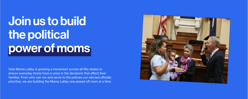
Hero block
| Field | Type | How to fill it |
|---|
| Titlerequired | Rich text | The main heading. The block only shows once this is filled. |
| Text | Rich text | Intro paragraph under the heading. |
| Button | Link | Optional call‑to‑action link. |
| Image | Image | Optional picture shown beside the text. |
| Image size | Select | Shape of the image: Large, Small or Vertical. |
| Hero background | Select | Dark or Light background style. Default: Dark. |
Body Text acf/body-text
A simple, comfortably‑width column of rich text — for articles and longer copy — with an optional button underneath.
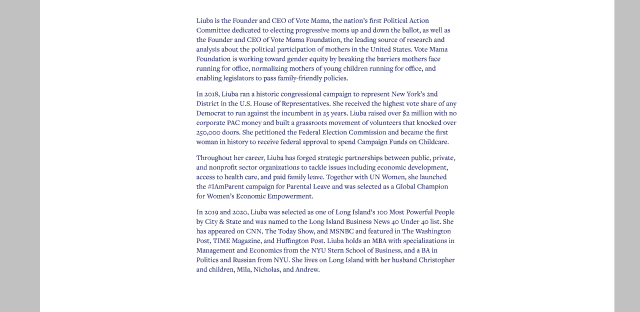
Body Text block
| Field | Type | How to fill it |
|---|
| Textrequired | Rich text | Your main copy (headings, paragraphs, lists, links). The block is hidden if this is empty. |
| Button | Link | Optional button below the text. |
Note: the settings form also shows With menu and Image fields, but this layout only renders the Text and Button. Leave the other two empty.
Call to Action acf/call-to-action
A two‑column prompt: a short heading on the left, text and a button on the right.
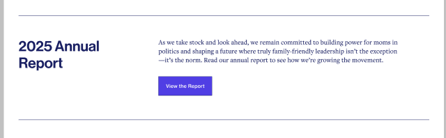
Call to Action block
| Field | Type | How to fill it |
|---|
| Titlerequired | Rich text | The left‑hand heading. |
| Textrequired | Rich text | The supporting copy on the right. |
| Buttonrequired | Link | The action button. |
All three fields are required. The block stays hidden until Title, Text and Button are all filled.
Full‑Width Call‑to‑Action Box acf/full-width-call-to-action-box
A full‑width highlighted box on a light background — same idea as Call to Action, but bolder and edge‑to‑edge.
No screenshot supplied for this block yet. It mirrors the
Call to Action layout in a full‑width box.
| Field | Type | How to fill it |
|---|
| Titlerequired | Rich text | Heading on the left. |
| Textrequired | Rich text | Copy on the right. |
| Buttonrequired | Link | The action button. |
All three fields are required for the block to appear.
Cards Highlight acf/cards-highlight
A grid of content cards (with image, tags, title and excerpt) introduced by a heading and a button. Pull cards in automatically, or pick them by hand.
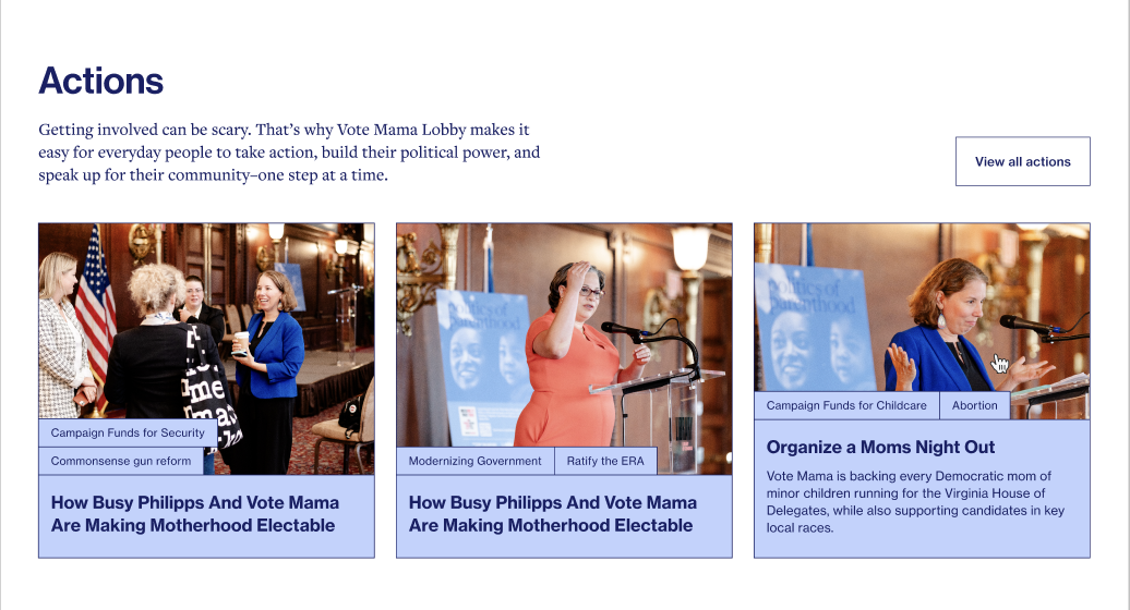
Cards Highlight — heading + "view all" button + card grid
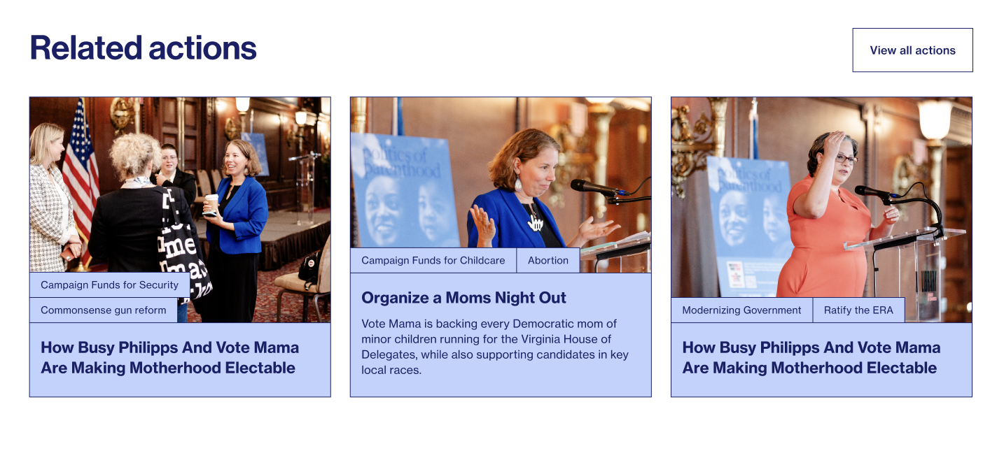
Same block, different content (cards with category tags)
| Field | Type | How to fill it |
|---|
| Title | Rich text | Heading above the cards. |
| Pre title | Text | Small label above the heading. |
| Text | Rich text | Short intro paragraph. |
| Button | Link | e.g. "View all actions". |
| Button position | Select | Bottom or Top right. |
| Cards type | Select | Which content to show: News, Actions, Team or Video. |
| Cards auto | Toggle | On → automatically show the latest items of the chosen type. Off → pick items by hand in Cards below. |
| Cards count | Number | How many cards to show when Cards auto is on. Empty = show all. |
| Cards | Relationship | Hand‑pick the exact items (used when Cards auto is off). |
Tip: use Cards auto for "latest news" style sections, and turn it off when you want to feature specific items in a specific order.
Cards Listing acf/cards-listing
Same idea as Cards Highlight, but used for people/team‑style cards and with an extra option to filter by a Team category.
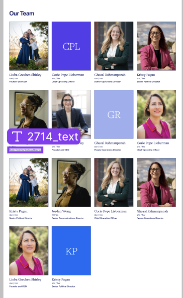
Cards Listing block
| Field | Type | How to fill it |
|---|
| Title | Rich text | Heading above the cards. |
| Pre title | Text | Small label above the heading. |
| Text | Rich text | Short intro paragraph. |
| Button | Link | Optional button. |
| Button position | Select | Bottom or Top right. |
| Cards type | Select | News, Actions, Team or Video. |
| Cards auto | Toggle | On = latest items automatically; Off = pick by hand. |
| Cards count | Number | How many to show in auto mode. |
| Cards types | Taxonomy | Optional — limit the auto list to one Team category. |
| Cards | Relationship | Hand‑picked items (auto off). |
Two‑Column Heading with Text acf/two-column-heading-with-text
A heading in the left column and rich text in the right, optionally with a side image, a button and social links.
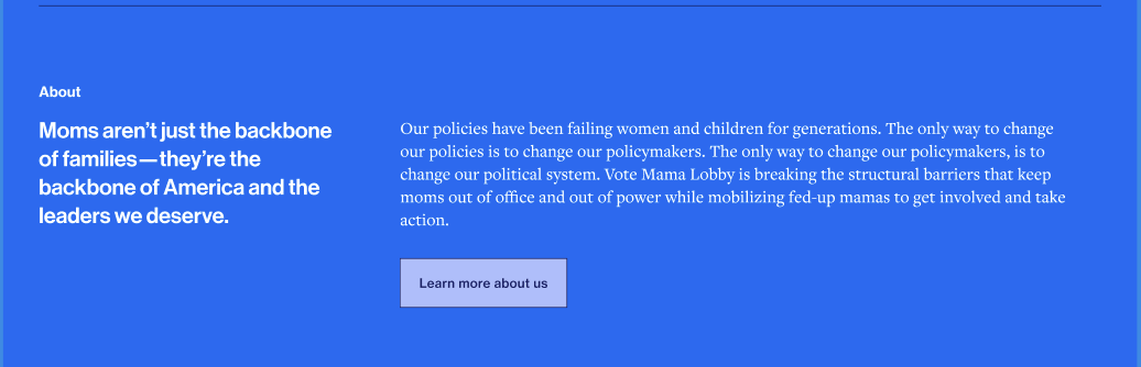
Two‑Column Heading with Text
| Field | Type | How to fill it |
|---|
| Titlerequired | Rich text | The heading (left column). |
| Textrequired | Rich text | The body copy (right column). |
| Pre title | Text | Small label above the heading (only shown in the no‑image layout). |
| Image | Image | Optional side image. Adding one switches to the image layout. |
| Image position | Select | Left or Right — which side the image sits on. |
| Button | Link | Optional button under the text. |
| Follow socials | Toggle | When on, shows social icons taken from Site settings → Footer → Follow links. |
| Background | Select | Dark or Light section background. Default: Dark. |
Layouts: no image = heading + text; with image you choose left or right placement. Title and Text are always required.
Large Quote acf/large-quote
A single emphasised quotation with an optional photo and author name.
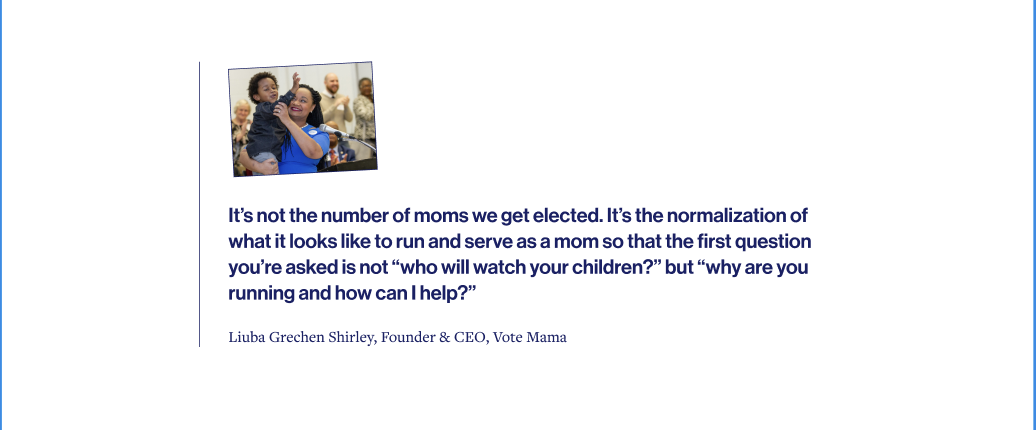
Large Quote block
| Field | Type | How to fill it |
|---|
| Textrequired | Rich text | The quote itself. The block is hidden if empty. |
| Author | Text | Who said it. |
| Image | Image | Optional portrait shown with the quote. |
| Image position | Select | Top or Bottom — where the image sits relative to the quote. Default: Top. |
Quote Slider acf/quote-slider
A carousel of quotes. The content comes from the Quotes content type — each slide shows the person's photo, name, the quote and its tags.
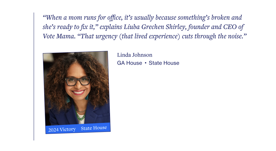
Quote Slider block
| Field | Type | How to fill it |
|---|
| Quotesrequired | Relationship | Pick the Quote entries to show, in order. Create them first under Quotes in the admin menu. |
| With menu | Toggle | Optional layout switch. |
Each slide is built from a Quote entry: photo = featured image, name = title, quote text = the entry content, tags = Quote Tags. Edit the wording on the Quote entry itself, not here.
Marquee Slider acf/marquee-slider
A large line of text that scrolls horizontally across the screen, like a ticker.
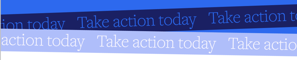
Marquee Slider block
| Field | Type | How to fill it |
|---|
| Text | Text | The phrase that scrolls across. |
| Slider height | Select | Low or High band height. Default: Low. |
Image with Accordions acf/image-with-accordions
An image on one side and a set of expandable accordions (question/answer style) on the other.
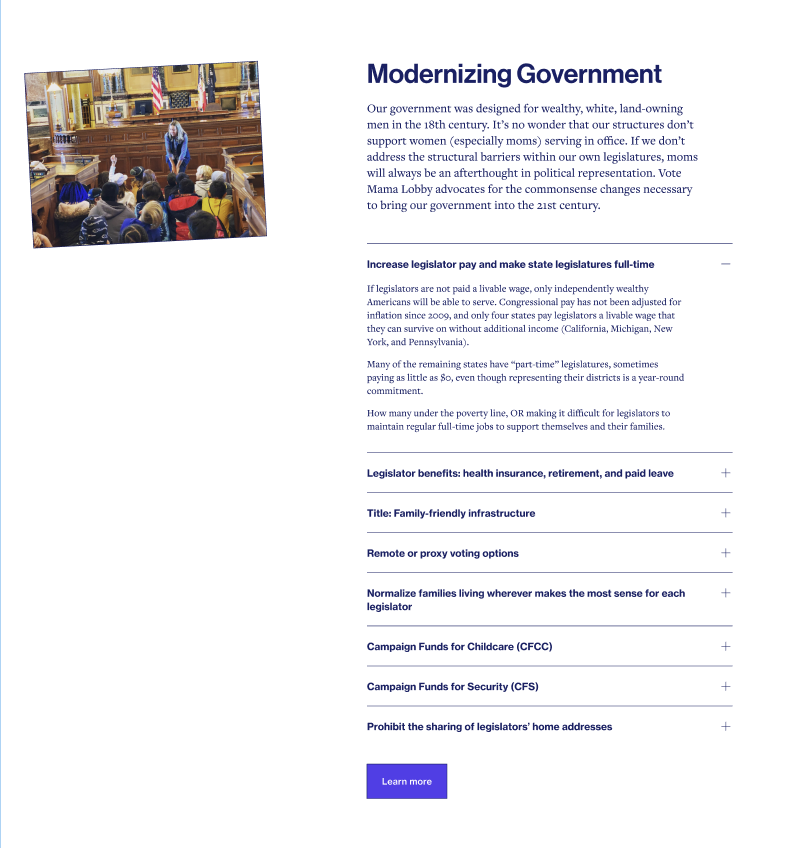
Image with Accordions block
| Field | Type | How to fill it |
|---|
| Imagerequired | Image | The side image. The block needs this to show. |
| Accordionsrequired | Repeater | Add as many rows as you need. Each row has a Title, a Text and an optional Button. Rows without a title and text are skipped. |
| Title | Rich text | Heading above the accordions. |
| Text | Rich text | Intro paragraph. |
| Button | Link | Optional button below the accordions. |
| Image position | Select | Left or Right. |
Accordion acf/accordion
A plain list of expandable rows (FAQ / "read more" style), with no image. Each row opens and closes on click.
| Field | Type | How to fill it |
|---|
| Title | Rich text | Optional heading above the rows. |
| Accordionsrequired | Repeater | One row per item, each with a Title and a Text. Rows missing either are skipped — so an empty block shows nothing on the page. |
| Add to side menu | Toggle | If the page uses a Section with Side Menu, include this section in that menu. |
| ID | Text | Optional anchor for linking to this section (e.g. #faq). |
Podcast acf/podcast-embed
An audio player card for a podcast or recording.
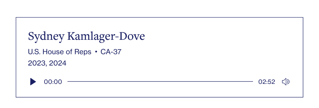
Podcast block
| Field | Type | How to fill it |
|---|
| Audiorequired | File | Upload or pick the audio file. The player is hidden if empty. |
| Name | Text | Person's name on the card. Hidden if left empty. |
| Role | Text | Role/office, e.g. "U.S. House of Reps". |
| District | Text | District, e.g. "CA‑37". Shown next to the role. |
| Years | Text | Years line, e.g. "2023, 2024". |
Now fully editable: the card's name, role, district and years are real fields — fill them per block. Each one is optional and simply hidden when empty.
Embedded Form acf/embedded-form
Drops in an external embed — typically a donation form or any third‑party widget that gives you an <iframe> snippet.
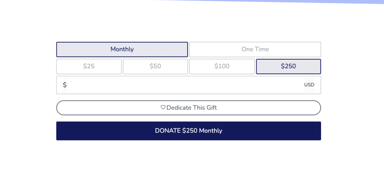
Embedded Form — e.g. a donation widget
| Field | Type | How to fill it |
|---|
| Iframe | Text area | Paste the full embed code (the <iframe …> snippet) the provider gives you. |
Paste the code exactly as provided. Don't add extra characters around it.
Posts Filters acf/posts-filters
A self‑service archive: a searchable, filterable grid of News or Actions with a "load more" button. Filters (the dropdowns) are generated automatically from the categories/tags of the chosen content type.
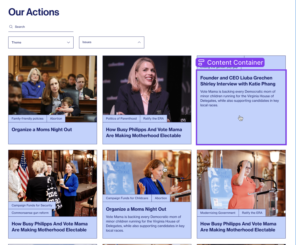
Posts Filters block
| Field | Type | How to fill it |
|---|
| Title | Rich text | Heading above the filter bar. |
| Post Type | Select | What to list: News or Actions. Default: News. |
The search box, the filter dropdowns and "load more" all work automatically — you only choose the content type and a heading.
Section with Side Menu acf/section-with-sidemenu
A two‑part layout: a sticky navigation menu on the side and a content area where you place other blocks inside.
No standalone screenshot supplied — this is a container layout you fill with other blocks.
| Field | Type | How to fill it |
|---|
| Menu | Repeater | Add the side‑menu items, each as a Link (label + target, usually an in‑page #anchor). |
| (content) | Inner blocks | Inside the block, add the sections that the side menu links to. Give each its ID so the menu can jump to it. |
Content types
These are the entries you manage from the left‑hand admin menu. Each one has its own list and "Add new" screen. Below: where to find each field and what it controls. Jump to one:
Content type News post
The standard WordPress "Posts" — used as the site's News / Media Center articles.
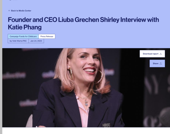
How a single News article opens — hero with title, category, author and date
| Field | Type | What it controls |
|---|
| Title | Built‑in | Article headline. |
| Content | Editor | The article body — built with the same blocks described in this guide. |
| Excerpt | Built‑in | Short summary shown on cards/listings. |
| Featured image | Built‑in | The hero/card image. |
| Author | Text | Displayed author name in the hero ("by …"). |
| Theme | Text | Optional topic label. |
| File | File | Optional attachment/download. |
| External Url | URL | If set, cards for this article link out to this address (opens in a new tab) instead of the article page. |
| Yt url | URL | A YouTube/Vimeo/MP4 link — when present, the hero shows a video player instead of the image. |
| Header background | Select | Dark or Light page header style. |
Grouping: Categories — shown as chips in the hero and used by the Posts Filters block.
Content type Actions actions
Campaign / advocacy items — often with a downloadable report. They open on their own page with a "Download report" and "Share" bar.
A single Action page uses the same hero layout as News (title, tag chips, date, image)
| Field | Type | What it controls |
|---|
| Title | Built‑in | Action title. |
| Content | Editor | Body of the action page. |
| Excerpt | Built‑in | Summary on cards. |
| Featured image | Built‑in | Hero / card image. |
| File | File | The report to download. Used first for the "Download report" button. |
| File url | URL | Alternative download link if the report is hosted elsewhere (used when File is empty). |
| Header background | Select | Dark or Light header style. |
Grouping: Themes, Issues, Actions Tags — Themes and Issues show as chips in the hero and feed the filters.
Content type Team team
People — staff and board members. Each has a profile page (unless disabled) and appears as a person card across the site.
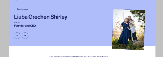
A single Team member page — name, pronouns, role, social links and photo
| Field | Type | What it controls |
|---|
| Title | Built‑in | Person's full name. |
| Content | Editor | Bio shown on the profile page. |
| Featured image | Built‑in | Portrait photo. If none, the card shows the person's initials instead. |
| Type | Select | Staff or Board. |
| Pronouns | Text | e.g. "she/her". |
| Role/Title | Text | Job title shown under the name. |
| Initials | Text | Override the auto initials used when there's no photo. |
| LinkedIn | URL | LinkedIn profile link (icon on the page). |
| Instagram | URL | Instagram profile link (icon on the page). |
| Text | Rich text | Additional text field. |
| Disable single page? | Toggle | When on, the card is not clickable and the person has no profile page. |
| Order | Page attributes | Use the "Order" box to control the sequence in listings. |
Grouping: Team Categories — used to filter people in the Cards Listing block. Each Team Category can also set a "Back to About link" so this person's "Back to About" button jumps to the right section.
Photo shape: when a person has neither a LinkedIn nor an Instagram link, their hero photo is shown as a square; with at least one social link it keeps the taller portrait crop.
Content type Videos video
Video entries. They can play a YouTube/Vimeo link or an uploaded file, and open on a centered video page.
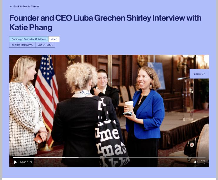
A single Video page (video in the hero)
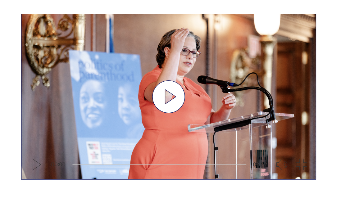
How a video appears with a poster & play button
| Field | Type | What it controls |
|---|
| Title | Built‑in | Video title. |
| Content | Editor | Description / body. |
| Excerpt | Built‑in | Summary on cards. |
| Featured image | Built‑in | The poster/thumbnail shown before play. |
| External video | URL | A YouTube or Vimeo link. |
| Local video | File | Or upload an MP4/WebM/OGG file instead. |
| Header background | Select | Dark or Light header style. |
Provide either an external link or a local file. Supported sources: YouTube, Vimeo, or an uploaded .mp4 / .webm / .ogg file. The featured image acts as the poster, and the video only loads after the visitor clicks play (keeps the page fast).
Content type Quotes quote
Reusable testimonials. You don't place these on a page directly — instead they feed the Quote Slider block.
See the
Quote Slider screenshot for how these are displayed.
| Field | Type | What it controls |
|---|
| Title | Built‑in | The person's name (shown under the quote). |
| Content | Editor | The quote text itself. |
| Featured image | Built‑in | The person's photo on the slide. |
Grouping: Quote Tags — shown as small tags on each slide.
Categories & tags
These group your content and power the filter dropdowns and the chips shown on cards and hero sections. You manage their terms under each content type's submenu.
| Name | Applies to | Style | Used for |
|---|
| Categories | News | Hierarchical | Chips in the News hero; filter dropdown in Posts Filters. |
| Themes | Actions | Tags | Chips in the Action hero; filtering. |
| Issues | Actions | Tags | Chips in the Action hero; filtering. |
| Actions Tags | Actions | Tags | Extra tagging for actions. |
| Team Categories | Team | Tags | Filtering people in the Cards Listing block. |
| Quote Tags | Quotes | Tags | Small tags shown on each quote slide. |
Tip: create the terms you need first, then assign them on each entry's edit screen (right‑hand panel). Empty categories don't show up in the front‑end filters.
Team Categories — "Back to About link": open a term under
Team → Team Categories and you'll find an optional
Back to About link field. Point it at a section of the About page — e.g.
/about/#staff, where
staff is the
ID you set on the matching section block on the About page. Every team member in that category then gets a "Back to About" button that jumps straight to their section instead of the top of the page. You can also give the link a
label to change the button text (otherwise it stays "Back to About"). Leave it empty to fall back to the global
Page about setting. If a person is in several categories, the first one's link is used.